Anand goes to the alcobev bazaar
Shining examples of innovative alcobev packaging emerge from the shelves while shopping for a world cup watch party.
18 Jun 2026 | 498 Views | By Anand Singh
The alcobev aisle of any luxury supermarket presents a series of packaging paradoxes. While some brands attempt to stand out on the back of their familiar, legacy branding built over years, others keep experimenting each season. Some choose to stick to the shape and materials largely associated with alcoholic beverages (to avoid confusing the consumer), others are vying to change the manual entirely.
While this might seem like a straightforward legacy versus innovation fight on the outset, modern alcobev brands fight much more nuanced battles. The choice of packaging material dictates everything from manufacturing costs to supply chain logistics–plastic and some metals are inherently lighter, hence easier to ship than glass. Here are five products that stand tall on the battlefield.
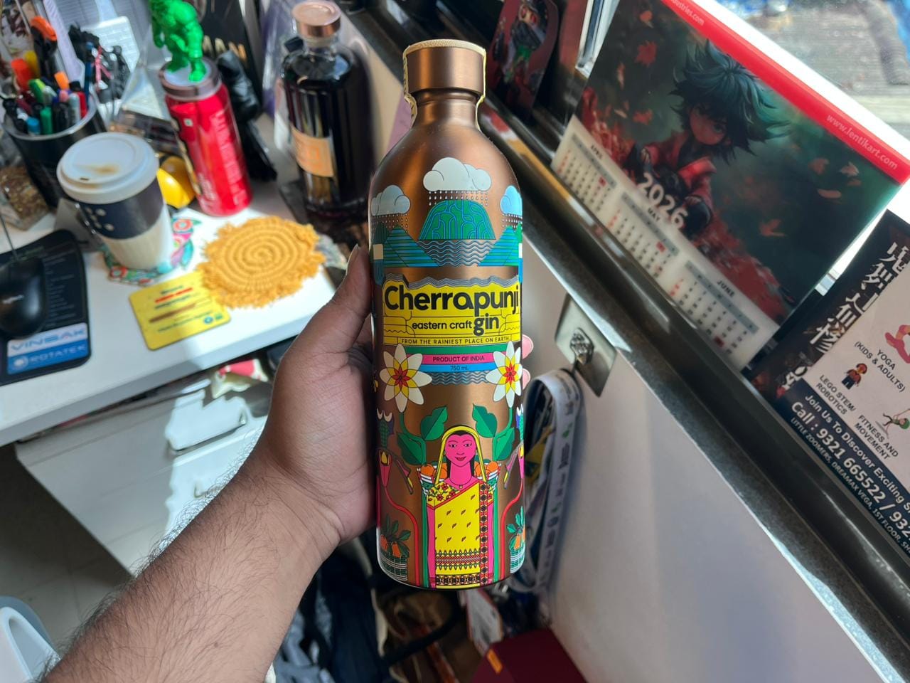
- Cherrapunji gin metal bottle: Readers of WhatPackaging? are aware of our love for this bottle, thanks to our extensive print story featuring the brand. Founder Mayukh Hazarika made two radical choices with this packaging–using steel instead of flint glass to make the bottles lighter, and cheaper to transport, and making use of local Khasi motifs (like the Khasi mandarin) to add to the brand’s ethos.
These motifs are meticulously UV printed on each bottle to ensure each bottle tells the story of “India’s first carbon-conscious gin” as intended.
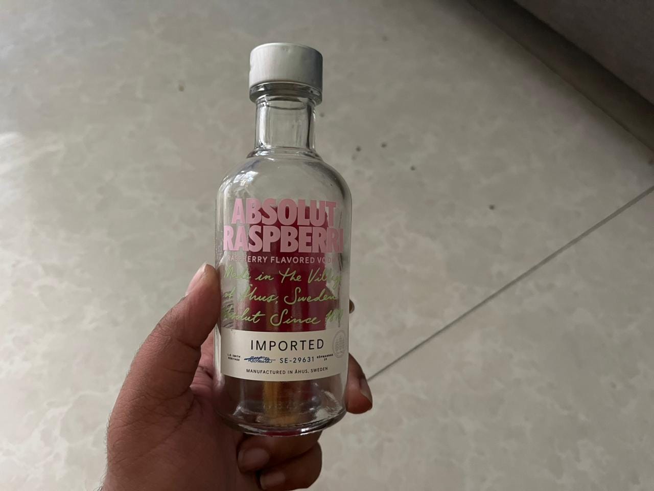
- Absolut Raspberri glass bottle: This medicine-bottle-inspired flint glass structure replaces traditional paper labels entirely with screen-printed typography directly onto its transparent surface.
By ditching the opaque sleeve, the design cleverly forces the vibrant, pink-tinted vodka inside to act as its own colorful backdrop, transforming the liquid itself into the primary element of the visual identity.
- Short Story gin glass bottle: This minimalist flint glass bottle utilizes a wrap-around matte paper label to position the product as a premium offering made with organically sourced ingredients. The label also features raised Braille lettering, seamlessly blending accessible design with contemporary typography.
Short Story is one of the few alcobev brands in the market making strides for physical inclusivity without drastically re-thinking the packaging.
.png)
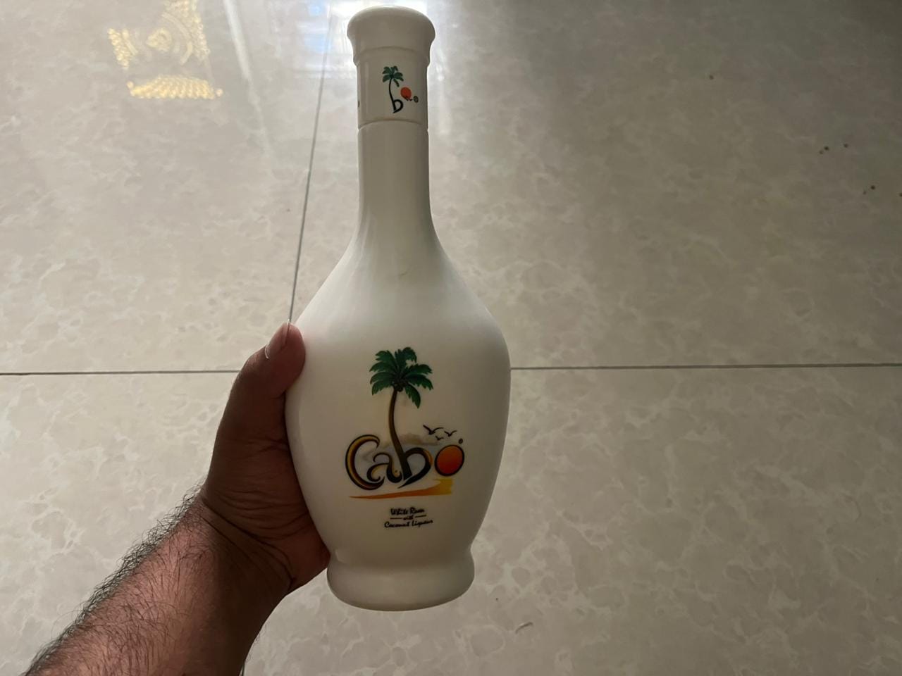
- Cabo white rum glass bottle: This flask-shaped structure utilizes a heavy, opaque-white frosted coating over glass to simulate the rustic, tactile appeal of a ceramic vessel.
The smooth, matte texture pairs with casual, sun-soaked typography to instantly anchor the brand to a laid-back, tropical "Goan vacation" aesthetic.
- Portugee Late Harvest Wine glass bottle: This dark amber glass structure elevates its canvas by pairing a monochrome neck capsule with a textured cream paper label featuring intricate, raised gold foil stamping.
The visual identity relies on ornate, blue-and-white azulejo tile illustrations to act as an immediate shorthand for Portuguese heritage, using the shimmering metallic accents to signal premium, late-harvest sweetness in a crowded wine aisle.
.png)