

Anand goes to the bazaar: The snack edit
Shopping for a cozy day-in ends in epiphanies about modern FMCG packaging in the food aisle.
11 Jun 2026 | By Anand Singh

Shopping for a day-in with a friend, I found myself in the food section of a local supermarket
Food and beverage aisles arguably see the most footfall in any supermarket/convenience store. These products attract the most attention, and by extension, face the most pressure to keep innovating and stand out in a category that sees new entrants by the dozen. Amidst all this, the products that win walk a difficult tightrope–they strike the right balance between design ingenuity, material innovation, and the sheer audacity to try and separate themselves from the rest.
Shopping for a day-in with a friend, I found myself in the food section of a local supermarket, letting the packaging decide what to snack on that afternoon. Here are five products that stood out.
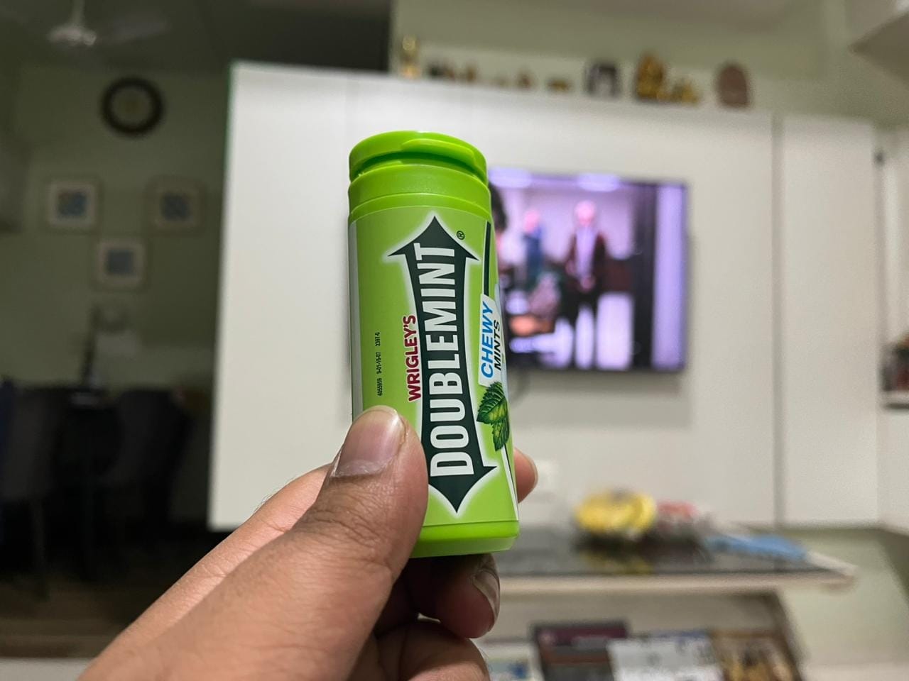
- Wrigley’s Doublemint rigid tube: A cornerstone of “pop and eat” packaging, this pocket-sized injection-moulded tube prevents delicate chewy mints from crushing under pressure. A built-in tamper-evident tear strip guarantees product integrity before transitioning into a tactile, single-handed flip-top cap for easy dispensing on the move.
- Mr Makhana stand-up pouch: This flexible laminate pouch uses clever sensory deception, utilizing a metallic gold foil substrate and a dripping chocolate graphic to mimic the standard candy packet. The twist, of-course, is that these are actually chocolate-covered popped lotus seeds. The pouch also comes with an integrated resealable zip-lock to preserve the crunchy texture of its constituents.
.jpeg)
- Bombay Sweet Shop bhujia pouch: A great example of packaging in service of differentiation. The pouch eschews traditional glossy namkeen plastics for a premium, tactile matte-finish multi-layer laminate that positions it as a “gourmet” product. Visually, its vibrant, illustrative color palette ditches generic product photography, using contemporary graphics to boldly communicate its unconventional Chilli Cheese flavor profile.
.jpeg)
- Slurrp Farm date powder pouch: This stand-up doypack utilizes a premium, organic-feeling matte paper-laminate substrate to immediately signal natural, clean ingredients to health-conscious parents. The front face relies on playful, kid-friendly mascot illustrations to soften the technicality of a single-ingredient sugar substitute. Flip the pack over, and the back panel effectively balances regulatory tables with a warm, story-driven brand narrative box detailing its origin by two mothers.
.png)
- Kwality Wall's Feast Cadbury Crackle flow-wrap: This flexible, multi-layer laminated plastic pouch uses intense color-blocking—relying heavily on Cadbury’s iconic, deep purple—to immediately signal a licensed collaboration and premium chocolate credibility on an otherwise commoditized shelf. It recognises the hero in this product: Cadbury’s chocolate, and lets it command the visual language.
.jpeg)