Pack View: Experts review packaging trends
Two packaging experts analyse a raft of products in the market. The parameters deployed are: aesthetic appeal, technical specifications, design aspects, and above all, sustainability
01 May 2025 | 3300 Views | By WhatPackaging? Team
Currygram’s Salt Dispenser

 Nitin Virkar, chief creative officer, Therefore Design
The packaging uses a typical bottle grinder design, with differentiation coming from a label that covers 40% of the surface. The bold, clean graphics prioritise the product name, while the brand name is understated, which may hinder brand recognition. The tough, clear plastic removable lid is difficult to remove, making it challenging for consumers to dispense the salt. The acrylic finish is brittle, raising concerns about plastic parts chipping and mixing with the clear rock salt. Often, the emotional and physical needs of commodity packaging are overlooked. Understanding user behaviour is key to creating differentiation.

Deepa Naik, general manager, packaging innovation for India, Europe, Middle East, and Africa (Lead), Hershey's
Currygram’s salt dispenser is designed for convenience, perfect for both everyday and fancy dining. The sleek, modern packaging aligns with the minimalist design of the dispenser. The clean label with elegant fonts allows consumers to instantly understand the product. In terms of functionality, the packaging is easy to open, reseal, and dispense, ensuring salt is used without spillage or clumping. The dispenser stands at 5.5 inches tall and holds 100g of salt. The top mechanism works like a grinder, with wheels that grind together when turned. The grinding produces fine salt from the spout, ideal for dressings. The cap seals the dispenser, making it moisture and pest-proof. The transparent PET body is see-through, allowing consumers to see how much salt remains.
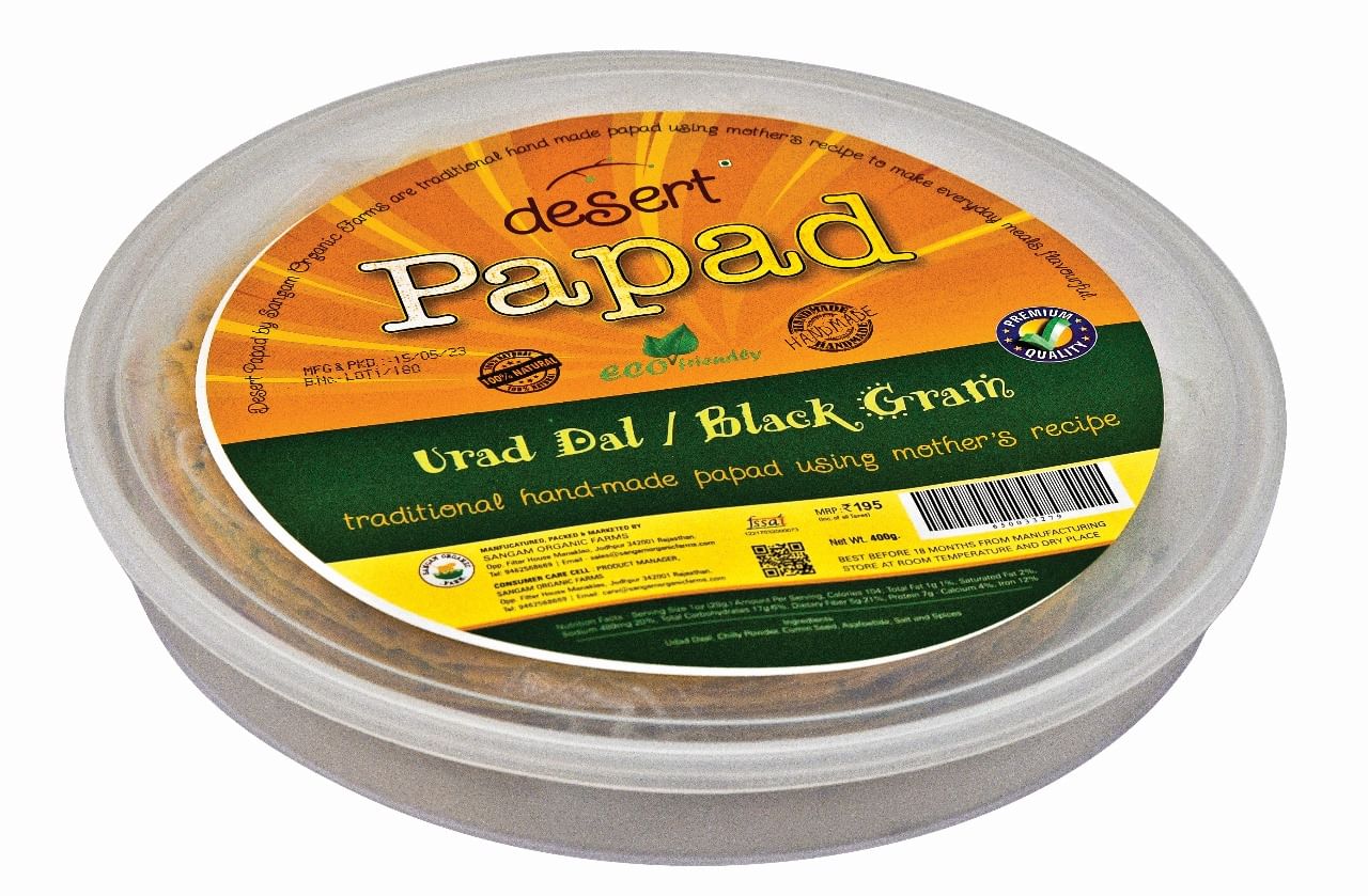
Desert Papad Pack
Nitin Virkar
The packaging features a plastic box that keeps the product secure during transport and can be reused, offering a good point of differentiation. However, it feels excessive, with shrink wrap on the outside and a pouch inside that surrounds the product, especially considering the traditional perception of papad. If the aim was to reposition papad as a premium product, the packaging missed an opportunity to highlight this with its graphic choices. The pack is busy with background effects, varying font sizes, and icons, which makes it appear cluttered. While the product name is emphasised for easy identification, the brand identity could be more visible. Achieving consistency in visual language and creating a cohesive packaging system is crucial for building a memorable brand.
Deepa Naik
The unique round-shaped pack differentiates itself from traditional papad packaging. It resonates with the round shape of the papad and offers a convenient way to store and transport these delicate snacks. Consumers don’t have to worry about storing an opened pack, as it can be easily accessed and resealed. Though the packaging is overdone, it is justified as it targets affluent consumers or aims to elevate the product’s perceived value.
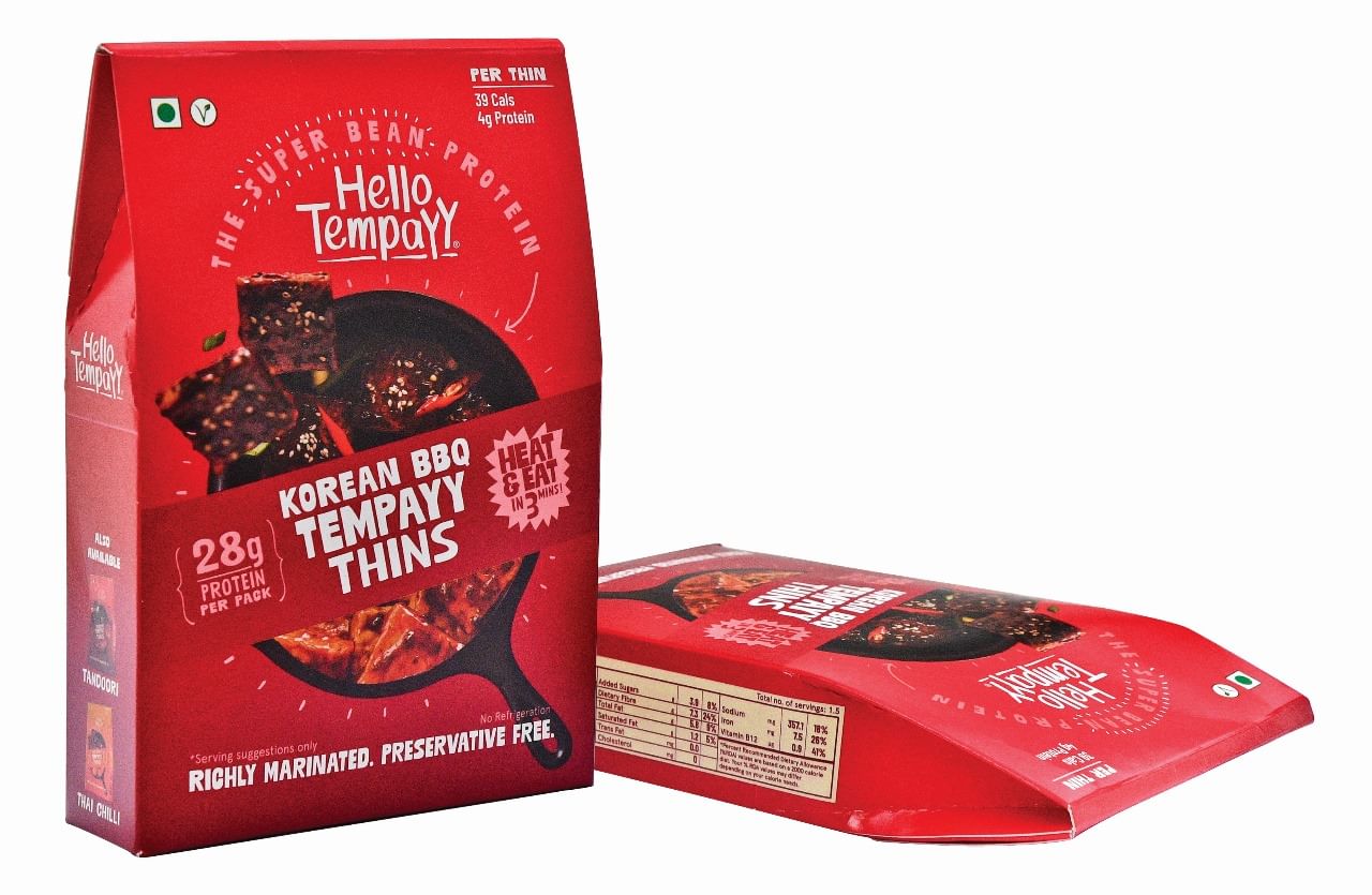
Hello Tempayy
Nitin Virkar
The simple carton structure mimics a stand-up pouch, making it stable and strong for transport. However, it is difficult to stack on shelves, although this may not be an issue for online sales. The packaging highlights the product name at the centre, and the brand identity is clear with ample safe space. The fonts are consistent, and information is placed with consideration for hierarchy. The packaging provides enough details for informed decisions but could improve the image used on the front, as the critical space is occupied by a blurred image. The print quality is subpar, with dull food images and low contrast. This makes it hard for new consumers to understand the product. The mention of soyabean on the back may be counterproductive if the market is still expanding.
Deepa Naik
Hello Tempayy’s packaging is clean and professional, with modern design elements conveying health and wellness. The tones and graphics highlight the natural, plant-based nature of the soya protein, appealing to plant-based consumers. The brand logo and product name are prominently displayed for easy identification on shelves. The typefaces are legible, and there is a good balance of information and imagery, such as illustrations of soya protein chunks, which aid consumer understanding. The paper-based stand-up carton has a tear-opening sticker, revealing the protein chunks in transparent pouches. The packaging provides clear usage instructions, serving size, preparation methods, and recipe ideas.
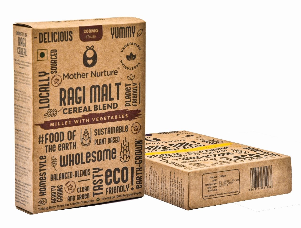
Mother Nature Ragi Malt
Nitin Virkar
The packaging takes a bold approach, moving away from Mother Nature’s usual colourful and playful style. It stands out among competitors focused on indulgent or wholesome imagery. The use of a small smudge of colour helps identify the variant, but the non-grid, single-colour typographic approach reduces brand visibility and complicates information hierarchy. The packaging aims to emphasise organic, natural, or sustainable qualities. The sturdy kraft board box is well-suited for eCommerce, but thought could be given to secure storage at home after opening, considering the product is for children and used in small quantities. The kraft board texture makes it hard to read the back, where nutrient information is printed in a faint font. The use of Hindi is refreshing, indicating a homegrown brand that acknowledges Indian language preferences. It will be interesting to observe the target audience’s response to this shift in visual language.
Deepa Naik
The Ragi Malt cereal blend comes in a 100% recycled paper pack, appealing to eco-conscious consumers who benefit from both the product and its environmentally friendly packaging. The highlight of the pack is the cloud art, with clustered words in various sizes emphasising its planet-friendly nature. Despite the cluttered text, the product name stands out clearly. The carton also includes concise labelling with nutritional information, usage instructions, storage details, and product benefits.