

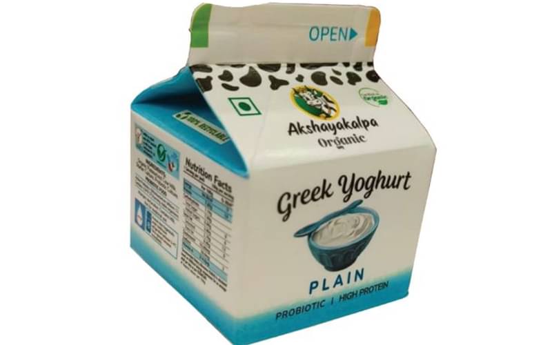
Pack View: Greek Yoghurt
Two packaging experts analyse five products in the market. The matrix they deploy is: aesthetic appeal, technical specifications, design aspects and above all, sustainability
22 Feb 2024 | By Disha Chakraborty
.jpg) Krupa Sheth, Stratedgy
Krupa Sheth, Stratedgy
The real estate on this pack is limited. In my opinion, it could have been utilised much better. It is always challenging to design smaller packs as one has to be judicious about the type of content to display. In my opinion, the overall hierarchy of information is amiss, and to an uninitiated buyer, the logo is lost, as more importance has been given to the product name than the brand logo.
Additionally, I feel like there are too many different typefaces used on the packaging that take away the cohesive look of the pack. The pattern of the cow seems to clash with the illustration on the logo unit. Overall, the top panel has way too much going on with multiple elements placed together but not working together to create a cohesive panel.
The printing seems fine for the category and audience. However, the image of the yoghurt could have been much-more appetising.
Nikhil Phadke, Elephant Design

Single-serving yoghurt has been packed in an unusual aspetic pack. But the pack did not hold well in transport.
Colour output was slightly dull and graphic quality blurred (I feel this is inherent to the nature of printing that transpires on an aspectic packaging).
The cow patterns are interesting but overall nothing stands out in this packaging.