

When the shelf becomes a thumbnail: the rise of quick commerce
In India, a wave of brands is stripping it out of desi flavours and on a crowded, algorithm-driven shelf, packaging design often determines which products get chosen. Megha Malik, co-founder and creative director of DesignerPeople, shares success stories of packaging design for online shelves
16 Jun 2026 | By Abhay Avadhani

Phirki Zero sold around 2.5 lakh units in under two months and close to 80% of them through quick-commerce platforms
India has earned a title no country wants. The ICMR-INDIAB study, published in The Lancet Diabetes & Endocrinology in 2023, estimated that about 101-million Indians live with diabetes and another 136-million are prediabetic in effect making the country the diabetes capital of the world. Sugar-sweetened drinks sit squarely in that story, and a generation of consumers is now trying hard to cut sugar.
The shelf has responded fast. In March 2025, Coca-Cola and PepsiCo rolled out no-sugar variants like Thums Up X Force, Coke Zero, Sprite Zero and Pepsi No-Sugar at an aggressive INR 10, the first time either had brought light drinks to that shelf in India so cheaply. Zero sugar, once a niche, is now mainstream.
The sharper move is happening below the giants. A “vocal for local” wave has pushed traditional Indian flavours jeera, masala soda back into the cooler, and the boldest challengers are now reformulating those desi favourites to carry no sugar at all: the taste of the street-side bottle, without the sugar load that put it on a nutritionist’s blacklist.
For the brands entering this space, the hardest problem is not flavour. It is visibility.
The shelf is now a thumbnail
The rise of quick commerce has rewritten the rules of discovery. A growing share of beverage purchases now begins not in a store but on a phone, where a product competes as a postage-stamp image among dozens of rivals.
“The shelf used to be a physical thing. Today it’s also a 200-pixel thumbnail on a delivery app,” says Megha Malik, co-founder and creative director of DesignerPeople, a Delhi-NCR packaging design agency. “If a packaging can’t be read and liked in under a second at thumbnail size, with no one there to explain it — it doesn’t exist,” she adds.
That compression has consequences. The tools of premium packaging are subtle illustration, fine typography, layered storytelling and all collapse at thumbnail scale. What survives is hierarchy: one dominant idea, one unmistakable colour, and one legible benefit.
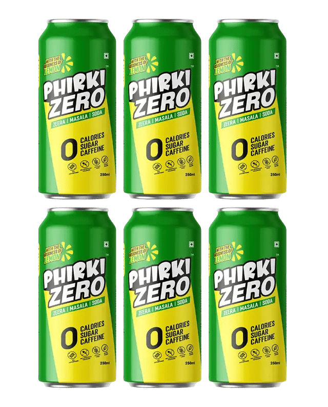
A study in compression: Phirki Zero
Those constraints framed DesignerPeople’s recent work for Phirki Zero, one of those desi-to-zero challengers, a jeera masala soda for health-conscious GenZ drinkers, with zero sugar, zero calories and zero caffeine. The brief was to launch a traditional Indian flavour as a contemporary, guilt-free lifestyle brand in one of FMCG’s most visually competitive categories.
The agency’s response was deliberately reductive. Rather than crowd the can, it built the identity around a single bold wordmark engineered to be legible from a distance and at thumbnail size. It is paired with a high-contrast green-and-yellow system signalling citrus freshness and energy. The “zero” proposition, the brand’s core purchase trigger, was treated not as fine print but as a primary design element, readable at a glance.
“With a new brand you don’t get a second look. You get a first impression, and it has to do all the work. The benefit and the personality have to land in the same instant on a shelf, in an ad, and on a screen the size of a stamp,” Malik says.
Early signs suggest the approach is working commercially. Phirki Zero launched in March 2026 and, according to the brand, it sold around 2.5 lakh units in under two months and close to 80% of them through quick-commerce platforms. The very thumbnail-scale shelf the packaging was built to win.
“On quick commerce, the pack has to sell itself in a split second, and ours does,” says Chirag Wadhwa, founder of CNN Foods, the company behind Phirki Zero. He continues, “Customers recognise it instantly and understand exactly what it stands for. The design has done a lot of the heavy lifting in our first few months.”
The execution was also picked up internationally, featuring on Packaging of the World, one of the design community’s most widely followed showcases and a marker of craft in a category where most launches pass unnoticed.
Where the category is heading
The brands that win India’s next beverage decade, Malik argues, will treat packaging as strategy rather than decoration, especially as tightening plastic-waste rules turn sustainability from a marketing claim into a material constraint. “Packaging is the first thing a consumer tastes. In a market this crowded, it isn’t the last step of building a brand. It’s the first,” she adds.
For a category being remade by health, heritage and the algorithmic shelf all at once, that may be the most useful design brief of all.
Founded in 2003, DesignerPeople is a branding and packaging design agency based in Delhi NCR, India, specialising in FMCG, food and beverage brands. Its work spans brand identity, packaging and label design for Indian and international brands.